Launch Watch · Current evidence
Published
NASA’s Gandak flood images: why two same-date maps differ
NASA’s October 2 Gandak images show late-September flooding. A reproducible test explains why two flood composites ending on the same date can differ.
NASA’s newly released Gandak River images make the late-September flooding visible, but two flood maps labeled with the same date can still give different answers. In a fixed NASA GIBS map request ending September 29, the two-day composite contains 8,606 flood-colored display pixels; the three-day composite contains 3,514. The difference is about map construction, not a measured timeline of flood recession.
NASA Earth Observatory’s October 2 image release pairs a September 20 Terra MODIS scene with a September 29 Aqua MODIS scene. NASA reports that heavy rain in Nepal’s Lumbini and Gandaki provinces on September 24–27 drove flooding along the Gandak, also called the Narayani, with water breaching or overtopping embankments and reaching settlements downstream. These are dated scenes, not a view of conditions today.
First, read the images as images
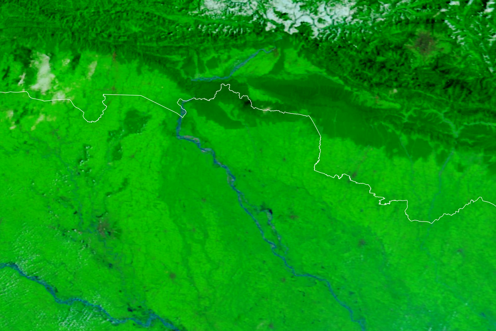
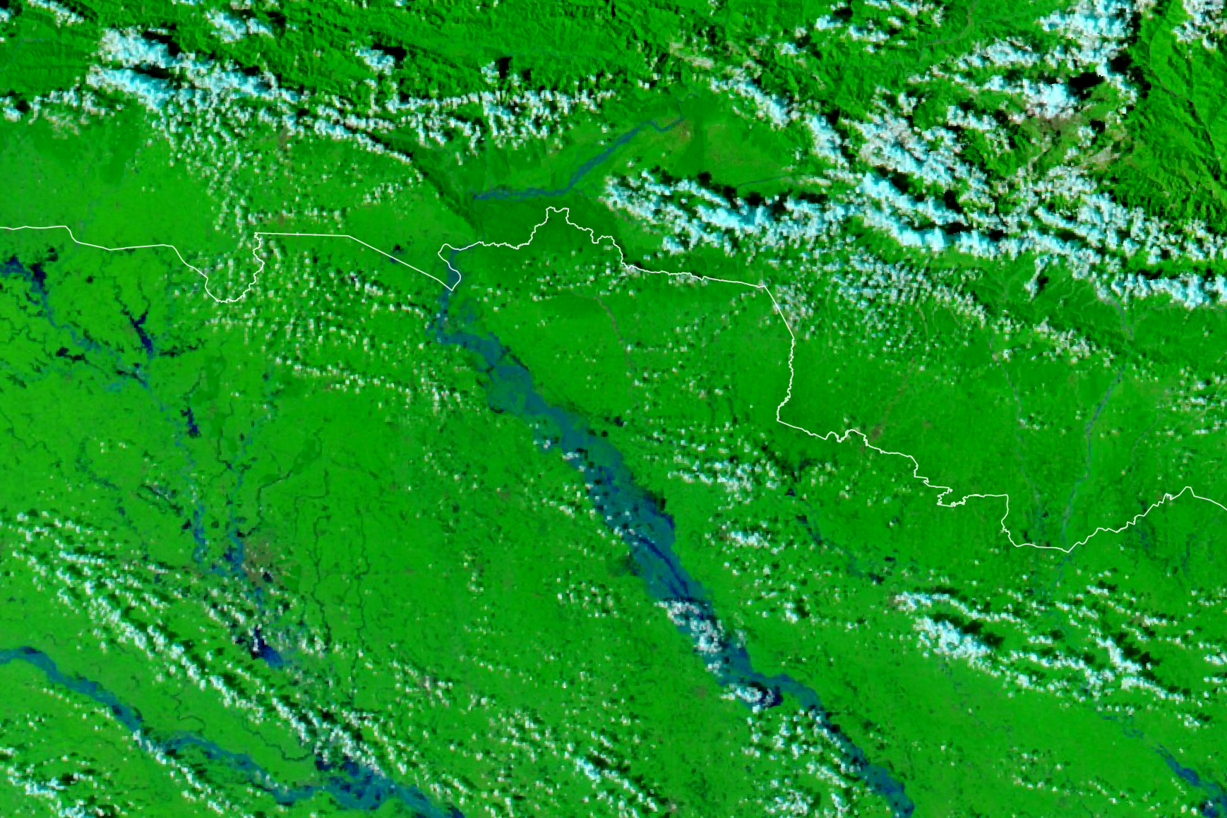
In NASA’s false-color rendering, water is blue, vegetation is bright green and clouds are light blue. The expanded blue corridor is visible in the later scene. The images also come from different satellite platforms. They provide geographic context for the event, but a blue-looking patch in this color composite is not itself the categorical flood label counted below.
Hold the ending date and footprint fixed
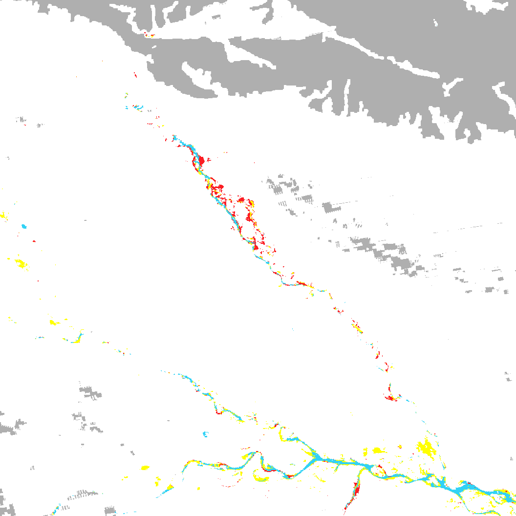
For a separate, reproducible test, we requested the MODIS Combined Flood two-day and three-day graphical layers from NASA GIBS. Both requests use September 29, 2026, the same rectangle from 83.3°E to 85.5°E and 25.5°N to 27.7°N, and the same 1,056 × 1,056 image size. The rectangle is an illustrative Gandak-region sample, not the entire catchment or an administrative boundary.
| Setting | Two-day composite | Three-day composite |
|---|---|---|
| Ending date | September 29, 2026 | September 29, 2026 |
| Included dates | September 28–29 | September 27–29 |
| Output size | 1,056 × 1,056 pixels | 1,056 × 1,056 pixels |
| Requested coordinates | 83.3–85.5°E; 25.5–27.7°N | 83.3–85.5°E; 25.5–27.7°N |
| Protocol / coordinate system | WMS 1.1.1 / EPSG:4326 | WMS 1.1.1 / EPSG:4326 |
The three-day product adds an earlier day. It is not a later satellite observation. NASA’s flood FAQ also makes an important distinction: GIBS serves graphical imagery derived from the flood product, not the underlying scientific data layers.
What the display-pixel experiment finds
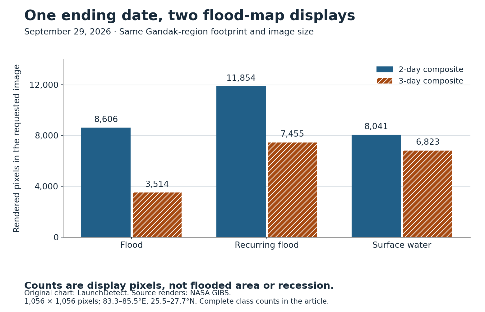
The three-day rendering has 5,092 fewer flood-colored display pixels, or about 59.2% fewer in this requested image. Both composites end on September 29. These are GIBS graphical-pixel counts, not square kilometers, a measured change in inundated area, a recession rate or an accuracy score.
| Display class | Two-day pixels | Three-day pixels |
|---|---|---|
| Flood | 8,606 | 3,514 |
| Recurring flood | 11,854 | 7,455 |
| Surface water | 8,041 | 6,823 |
| Insufficient data | 148,399 | 153,807 |
| Transparent | 938,236 | 943,537 |
| Total | 1,115,136 | 1,115,136 |
We counted exact RGBA colors from the official GIBS legend. Every nontransparent pixel matched a listed class; there were no unmatched colors. Transparent pixels were kept separate because the display can hide different underlying meanings. They were not relabeled “dry,” “safe” or “insufficient data.” Download the complete class-count CSV.
The maps are not even a simple smaller-versus-larger nesting. At the same image coordinates, 2,874 pixels carry the flood color in both renders. Another 5,732 carry it only in the two-day render, while 640 carry it only in the three-day render. A smaller total therefore does not mean that the three-day picture is just the two-day picture with some flooded places removed.
Inspect the pixel-by-pixel comparison
| Comparison | Rendered pixels |
|---|---|
| Flood color in both | 2,874 |
| Flood color only in two-day | 5,732 |
| Flood color only in three-day | 640 |
| Flood color in neither | 1,105,890 |
The 25-row transition CSV retains every pairing among the five display classes. These are display-label transitions between products, not transitions through time or evidence that a particular location dried out.
Why an extra day can produce fewer flood labels
The compositing step seeks repeated water detections to reduce false positives from moving cloud shadows. It also changes which observations are available. The current NASA user guide, section 3.3 and Table 2 (PDF) says the required number of water detections depends on the total available observations within the window. For example, three or four observations require two water detections; five to seven require three.
This matters because the product is not simply the union of every place that looked wet on any included day. An added day can change the observation count and the applicable threshold. We did not retrieve the underlying observation-count layers, so this experiment cannot attribute each changed display pixel to a particular cloud, observation or threshold.
NASA also warns that clouds, missing data, short-lived floods and errors in reference-water mapping can limit what these products show. A more restrictive display is not automatically ground truth. Insufficient-data labels cannot establish dry land, and the absence of a flood color cannot establish safety.
Open the exact two NASA GIBS source renders
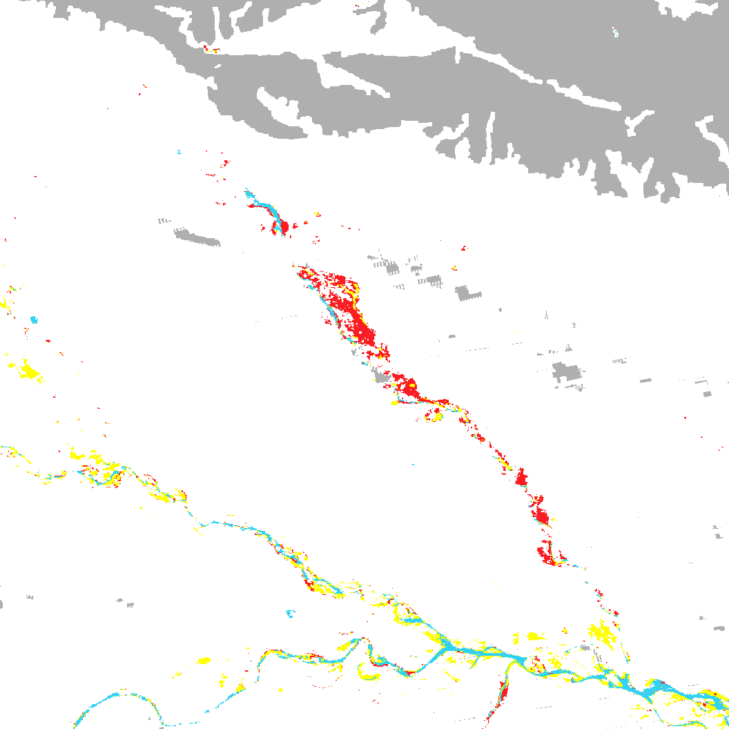
These source PNGs are unchanged. The legend uses red for flood, yellow for recurring flood, cyan for surface water and gray for insufficient data. Transparent areas retain their original transparency. The native table above provides the same class labels as text.
A practical way to compare the next flood map
- Keep the dates attached. Distinguish the scene acquisition, composite ending date and article release date.
- Keep the product settings attached. Record the window, footprint, output size and legend before comparing totals.
- Preserve uncertainty. Do not merge transparent or insufficient-data areas into dry land.
- Match the data to the question. For a scientific area estimate, use the source flood product and appropriate geospatial methods, rather than scaling pixels from a browse image.
NASA’s Gandak images help show what happened across a large region. The same-date experiment explains why a smaller colored patch in a different composite is not, by itself, evidence of improvement on the ground. Use current local-authority information for safety decisions; this historical display comparison is not emergency guidance.