Launch Watch · Earth
Published
Lake Erie’s 2011 bloom on one map grid: what the images can show
Register the October 5 Landsat and October 9 MODIS bloom images to one footprint, then separate visible color, biomass estimates and toxin measurements.
Put the two famous October 2011 Lake Erie bloom images next to each other and one immediate problem appears: they do not originally cover the same map footprint. The Landsat view is detailed and local. The MODIS product covers a much larger region. A casual side-by-side comparison can mix a change in framing with a change in the lake.
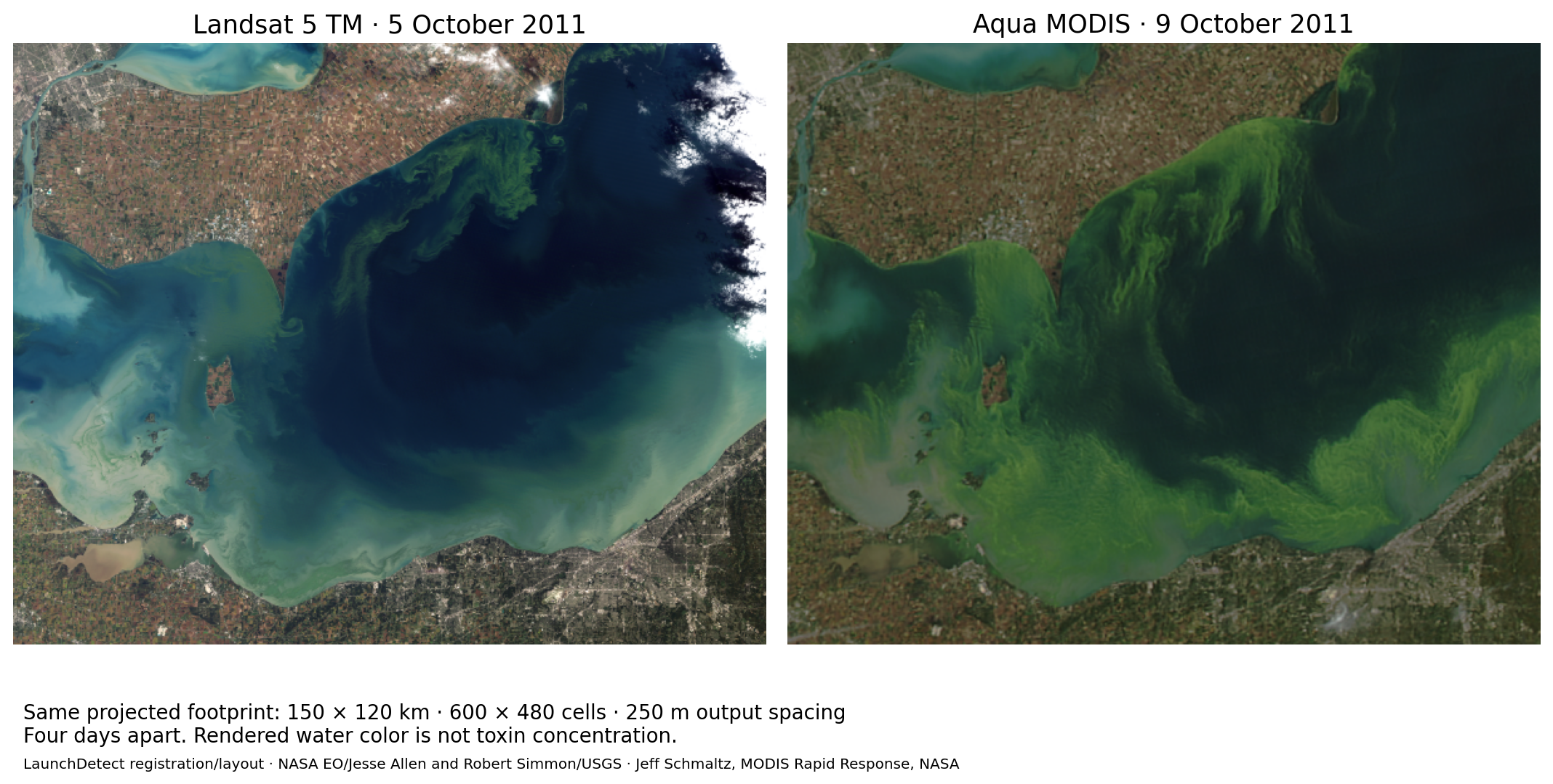
We reprojected both source GeoTIFFs onto one grid covering the same 150 × 120 km projected footprint. The registered pair below makes the visible green patterns easier to compare. It also leaves two essential facts intact: the observations are four days apart, and neither image directly measures toxins.
What becomes clearer on the same grid
The northern shoreline and islands now occupy corresponding positions. In the 5 October Landsat view, narrow green filaments extend into the lake from the northern side. In the 9 October MODIS view, visible green patterns are broader across much of the displayed western basin. Readers can inspect those patterns against the same shoreline instead of mentally matching two differently framed images.
NASA Earth Observatory’s account identifies the acquisition dates as 5 October for Landsat 5 and 9 October for Aqua MODIS. It describes the bloom’s expansion during that period. Our registered images let readers examine the rendered patterns within a common footprint; they do not independently quantify that expansion.
In particular, we have not measured a bloom-growth rate. The pair changes date, sensor and image processing at once, and clouds obscure part of the Landsat view. Matching geography removes one obstacle to comparison. It leaves those other differences unresolved.
The registration, in numbers
| Property | Landsat source | MODIS source | Registered outputs |
|---|---|---|---|
| Acquisition | 5 Oct 2011 | 9 Oct 2011 | Original dates retained |
| Grid dimensions | 5,000 × 4,000 | 3,600 × 2,800 | 600 × 480 each |
| Coordinate system | WGS 84 / UTM 17N | WGS 84 latitude/longitude | WGS 84 / UTM 17N (EPSG:32617) |
| Grid spacing | 30 m | 0.00317958° × 0.00224830° | 250 m × 250 m |
| Resampling | Original rendered product | Original rendered product | Average |
| TIFF creation stamp | 13 Oct, 17:00:59 | 13 Oct, 12:02:59 | Not used as acquisition time |
We used the Landsat GeoTIFF and MODIS GeoTIFF linked by NASA. Their embedded coordinate systems and geotransforms supply the placement. No hand-drawn shoreline alignment is involved.
The output bounds in UTM zone 17N are 321,135 to 471,135 meters easting and 4,574,715 to 4,694,715 meters northing. Subtraction gives 150,000 by 120,000 meters. At 250-meter spacing, that produces 600 by 480 cells, or 288,000 output cells per panel.
Those 288,000 cells include land, water and potentially obscured or no-data locations. Multiplying them by cell area would describe the projected rectangular footprint, not the bloom’s area. We did not classify water pixels or make a bloom mask.
The 250-meter output spacing is also a processing choice, not proof that every contributing spectral band resolves features at 250 meters. Resampling puts values onto a common grid; it cannot manufacture finer source information. These are rendered RGB products rather than a pair of calibrated reflectance datasets prepared for quantitative change detection.
Green water, biomass and toxins are different quantities
The visible pattern is the first level of evidence: where the rendered image shows a color feature. A satellite biomass estimate is a further analytical product that uses a method for relating spectral observations to properties of the bloom. Toxin concentration requires another kind of evidence.
The EPA’s HAB monitoring guidance explicitly distinguishes satellite-derived biomass estimates from toxin data. It explains that satellites cannot directly detect toxins. A greener-looking pixel therefore does not supply a microcystin concentration, and a change in displayed green does not establish a proportional change in toxin concentration.
For this case, we stop at the visible image comparison. We have not applied a biomass retrieval, estimated chlorophyll concentration or paired the pixels with a laboratory toxin measurement. Nothing in the figure establishes whether water at a particular place and time was safe for recreation or drinking. Historical source descriptions of a toxic bloom should not be converted into a numeric toxin map that the imagery never provided.
Why the file’s timestamp would give the wrong dates
Both GeoTIFFs carry creation timestamps on 13 October 2011, after their acquisitions. If those file metadata stamps were treated as observation times, the four-day gap would disappear and the pair could look simultaneous.
We instead use NASA’s acquisition labels: 5 and 9 October. The TIFF creation stamps remain useful for tracing the prepared artwork, but answer a different question. The caption dates, the instrument identities and the geography all need to survive a derived comparison.
Reproduce the registered comparison
Download the two original GeoTIFFs linked above. In GDAL, reproject each to EPSG:32617; set the bounds to 321135 4574715 471135 4694715, the output size to 600 by 480, the resampler to average, and destination no-data to 0. Equivalent options are: gdalwarp -t_srs EPSG:32617 -te 321135 4574715 471135 4694715 -ts 600 480 -r average -dstnodata 0 input.tif output.tif.
We independently reran this grid-size form and compared the decoded arrays with the earlier 250-meter-resolution form. Both output arrays matched exactly. This checks reproduction of the registration, not physical accuracy of the source imagery.
Download the registration ledger as CSV. The complete source data are available in the two original NASA GeoTIFF links above; the comparison figure supplies the derived visual result. Credits for the imagery and modifications are retained in its caption.
The useful result is a more honest visual comparison: the same map area, with the real time gap visible. It supports discussion of the bloom’s appearance while keeping biomass and toxin claims tied to the separate measurements they would require.
Imagery credits are retained in the caption. Registration, resampling and layout are by LaunchDetect. Reuse follows NASA media guidance and USGS Landsat data-use guidance. Source files and documentation were checked on 4 October 2026.