What a thermal image color bar actually represents
A color bar tells you how a display assigns colors to values. To read it correctly, identify three things separately: the quantity being displayed, its numeric scale and units, and the palette. A red pixel has no temperature meaning until those pieces are known.
This matters when a thermal image accompanies a launch story. A dramatic color can draw attention to a feature, but its appearance does not by itself identify the feature or measure rocket-exhaust temperature. The legend belongs with the image, especially when the image is cropped, resized or shared outside its original page.
Start with the product label, not with an intuition that red must mean hot.
Quantity, scale and palette answer different questions
The quantity says what the numbers mean. The scale says which numbers are shown and in what units. The palette determines how those values look on the screen. Two displays can use the same quantity and values while looking strikingly different.
For a concrete product definition, the NCEI record for ABI Cloud and Moisture Imagery identifies the imagery values for ABI's emissive bands as top-of-atmosphere brightness temperatures in kelvin. That precise label should survive into a caption. Replacing it with “exhaust temperature” changes the claim.
Even official pages may be describing different visualizations. NOAA's Colorized Infrared page explains that its displayed colors represent cloud-top height; it associates yellow and orange with taller clouds. This is a description of that particular presentation. It is not a universal key for every infrared image, and it should not be borrowed as the temperature legend for another product.
If the legend says temperature, read its full name and unit. If it says height, read it as height. If it labels a derived index or category, do not manufacture a temperature scale because the underlying observation involved infrared wavelengths.
Same numbers, different palettes
The teaching strip below contains three invented brightness-temperature values: 240 K, 270 K and 300 K. They are not measurements of a satellite scene, a cloud or a launch. The colors were chosen only to demonstrate a display mapping.
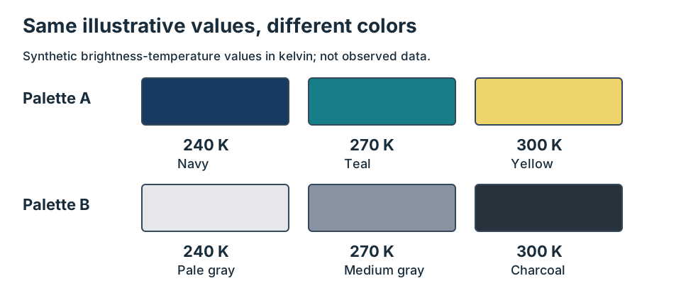
Original schematic. The same illustrative numbers receive different colors; no real imagery or instrument calibration is used.
| Illustrative value | Palette A | Palette B | What changed |
|---|---|---|---|
| 240 K | Navy | Pale gray | Display color only |
| 270 K | Teal | Medium gray | Display color only |
| 300 K | Yellow | Charcoal | Display color only |
In Palette A, the largest number is bright yellow. In Palette B, it is dark charcoal. A rule such as “the brightest part must be hottest” fails in this exercise because brightness on the page is a design choice. The numeric order stays 240, 270, 300 in both rows.
Try covering the numbers. Could you reconstruct them from the colors alone? Only if someone also supplied the mapping. Now cover the colors instead: the values remain readable. That is why the strip repeats each numeric label and why a usable figure should not make color the only way to recover its meaning.
There is a second comparison trap. Imagine two hypothetical frames whose palettes are each stretched independently to their own minimum and maximum. Both could contain a yellow patch even when the yellow labels correspond to different numbers. To compare their apparent intensity, first check that the quantities, units and mappings match. Otherwise, the color comparison answers a question about the displays rather than the observations.
A single-band palette is different from an RGB composite
A single-band display may map one value at each pixel through a color scale. A composite can assign different bands to the red, green and blue display channels. NASA's false-color interpretation guide explains how band assignments can make familiar features appear in unfamiliar colors.
Ask for the composite recipe when an image is labeled RGB or false color. The phrase “false color” alone does not tell you whether you are seeing a one-variable palette or a multiband combination. An attractive red region in an RGB product does not automatically correspond to a single entry on a temperature bar.
This article does not supply a recipe for retrieving physical source temperatures. It supplies a way to read the display honestly. If the intended claim needs a retrieval, uncertainty estimate or a correction for measurement effects, obtain the corresponding method and technical review.
Five checks before describing a colored feature
Use this original worksheet for the particular image in front of you. It is intentionally a reading checklist rather than a calibration procedure.
- Name the quantity. Write the product's full label. Is it radiance, brightness temperature, a retrieved property, a difference, an index or a class? “Thermal” is not enough.
- Read the units and endpoints. Record kelvin, degrees Celsius or the actual stated unit. Note the displayed range. If the scale is unnumbered, preserve that limitation.
- Identify the mapping. Check which end is high and which is low. Ask whether the intervals are uniform, whether end colors collect values beyond the displayed range, and whether a separate color represents missing data. Record only documented answers.
- Check comparability. For a sequence or side-by-side figure, compare the band or recipe, quantity, units and scale choices. A shared palette name is insufficient if the numeric ranges differ.
- Write the bounded result. Describe the displayed value or category that the legend supports, and keep object identity or physical temperature claims separate. If the legend is missing, request it rather than decoding by resemblance.
Here is a sample completed line for the teaching strip: “Synthetic brightness-temperature values, in kelvin, are shown at 240, 270 and 300. Palette B assigns the highest illustrative value the darkest color. No source temperature has been measured.” Every part of that sentence can be checked within the exercise.
Keep the legend attached to the claim
For a real figure, place a readable legend beside the image, name the product in the caption and link the source documentation. If a crop excludes the original legend, restore the correct legend or explicitly identify what is unavailable. Do not substitute a visually similar scale from another image.
If the scale is too small to read in a mobile layout, moving a copy into the caption or accompanying text can preserve the information. That copy must agree with the actual figure. Accessibility helps verification here: readable units, explicit endpoints and text labels allow more readers to inspect the same claim.
For the broader measurement limits, see what a satellite thermal signal says about a launch. For examples of the varied phenomena behind weather-satellite pictures, see what weather satellites can show beyond clouds. Begin each new image with its own key, even when its colors look familiar.